
25 clever mobile/web interactive designs
A lot of us have been using the internet and mobile phone for over 15 years and have seen the evolution of the technology and related devices over the years. I personally moved from using the early age Nokia 3310 more than a decade ago, to the newer phones of Apple and Samsung. Through this progression, the web/mobile features, the technology and the options available have evolved and have drastically improved the user experience of these products.
We have a lot of products today which solve many problems for us and are extremely engaging thanks to their amazing UI and UX designs. Here is my tribute to the evolution of UX where I have listed 25 clever mobile and/or website interactive design features.
Category 1: Navigation
- Swipeable Carousel:
The swipeable carousel feature is one in which a user can view a set of photos, videos just by swiping and moving from one item to the next without opening them up to full screen and while being in the current position in the feed.
I have personally loved this feature, as often I do not want to expand a photo and just want to view all the photos by swiping through them.
Instagram uses this feature to group and show photos and videos in the feed. It has it’s variations too — Single item display, Multiple items display, responsive displays, variable widths of items grouped, adaptive heights, lazy loading and so on.
2. Back to top buttons:

How often has it happened that you have read a long article and now want to go back to the top of the page? And to do this you end up scrolling all the way to the top or press Ctrl+Home?
To make this easier, a lot of the news websites and many others too have incorporated the ‘Back to the top’ buttons on their web pages. Typically these are placed at the bottom right corner of the websites. A user can anytime click on this button and will be navigated to the top of the page.
To improve the UI here, a lot of the designers make this button visible only when a user scrolls the page (up or down).
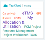
3. Tag or Word Clouds:
This is an amazing concept having varied use cases. A ‘Word Cloud’ is basically an image of different sized words where the size of the word indicates the frequency of it’s use or it’s importance quotient.
This concept is also extended to display menu options, and is used in analytics to identify most used features or words in a document and so on. It is quite interesting how much a smartly laid out set of words can say about usage or prompt someone to use features.
For example — the image below is a word cloud of most frequently used features on a web application. Clicking on any of these words will take the user to the relevant option page.
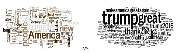
Another example here shows word clouds of Obama’s and Trump’s speeches from their election campaigns. I’ll leave it to you to guess which word cloud belongs to whom :)
4. Parallax Scrolls:
Parallax scrolls are websites or apps in which the background moves at a different speed as compared to the overlaid screen, thus producing a visual depth, especially for cases needing to depict distances, movement of objects etc.
This feature has been predominantly used to generate curiosity amongst users through a narrative.
It may have a limited use, as this design concept is more focused on moving objects and is used for use cases where almost entire website is in 1 long page and has few options. Below is an example of a web page designed with parallax scroll concepts.
Click on the link above to experience the parallax scroll design concept on your own.
5. Chat Heads:

Messenger windows popping up in the form of a user head when a user navigates away from the messenger is called a chat head.
Chat heads basically help a user in not abandoning one’s current work or application and meanwhile continue chatting with another user in between using this chat head.
6. Infinite scrolls or pagination:
‘Infinite Scrolls’ is a technique in which the content of a page continuously keeps loading as a user keeps scrolling through the feed. Here, there is no navigation from page to page and is usually useful when there is a need to display rapidly changing content on the screen.
Best examples would be the feeds of Facebook, Instagram, Twitter etc. A lot of mobile phones also have their applications laid out in an infinite scroll format even though the contents do not change very fast in a dynamic manner.
‘Paginations’ on the other hand are page wise listings where all the items are listed in sets across multiple pages. There are navigation buttons to scroll from one page to the other. Apple iPhones use ‘Pagination’ for listing the items on the iPhone screen. Google search results are displayed in a ‘Pagination’ format. The common theme in the examples being that the results are not changing dynamically at a very fast speed.

Category 2: Menus, Bars & User Info features
7. Hamburger and Tab menus:
These are the 2 popular types of menus in web pages and mobile applications.
Hamburger menus are ones in which we have a

button in the application and the file menu remains hidden till the user clicks on this icon. Its called the Hamburger menu because the icon symbolizes 2 buns and the meat in between like a real hamburger. The image below explains this analogy.
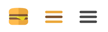
Since this button hides the menu options and has low discover-ability, it is recommended to be used for secondary features like settings, profile, sign out etc and not for the option which gives the main value proposition of the application or the website.
Tab menus are the short/small menus clearly visible in an app or a website and resemble the different tabs in a browser. Since these menus have high discover-ability, these are mainly used for the main value proposition features of an app or a website.
8. Foldable Menus
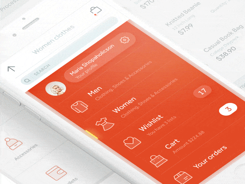
These are a variation of hamburger menus such that these are more vertical scroll aligned from the top and cover the entire screen when expanded.
Foldable menus are used more to select options like categories etc typically common in e-Commerce applications.
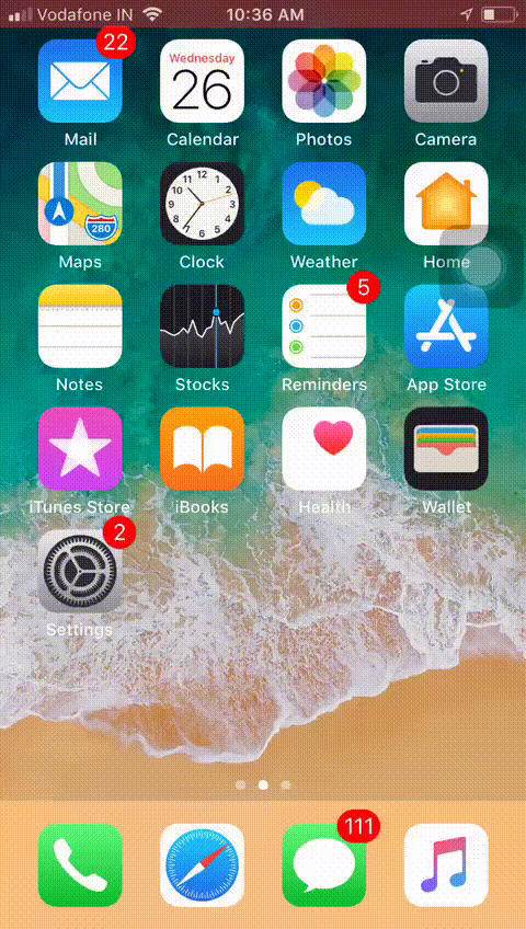
9. Icon Badges:

These are more common in mobile phones where in the icons of all applications, we see a number highlighted indicating the number of new or unread. This helps in viewing the count of unread notifications in various applications while just scrolling through the mobile screens.
10. Screen overlays:
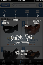
This feature is extremely useful in websites which are complex or have complex products or have target users who need a lot of hand holding.
‘Screen Overlays’ as the name suggests are transparent screens on top of base screens. These are used to display any useful information about options on the base screen. For example, what does any button or feature on the base screen do?
Over the years this has been mainly used to show instructions & tips but of late a lot of websites (especially e-commerce ones) are using this feature for viewing of product images in the product feeds.
Category 3: Page Design
11. Ghost buttons:

These are buttons which blend with the web or mobile app backgrounds. These can be seen just as border lines with plain text written inside and are more common in web pages.
Among phones, Apple makes a lot of use of these type of buttons.
Why are they so popular? — These buttons help in creating a focal point in the imagery of the page and hence generate a more intuitive user experience. It is very important to get the aesthetics of the background page and the ghost button in sync else it will disrupt the UI in a very negative way and the UX will not be as desired.
12. Segmented control:

This is basically designing the page layouts in a very segmented or tiled manner marking a clear segregation of sections with the help of page aesthetics. A very clear and precise differentiation of the segments helps generate a very clear and intuitive UX unlike a cluttered one.
13. Double tap — menu options:
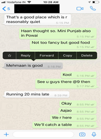
Another popular feature these days is to not even have any buttons to expand and show menu options. Some applications expect the user to perform certain intuitive actions to display to them the options menu.
Example — the Whatsapp feature to double tap on a chat message to see the menu options of Reply, Forward, Copy, Delete etc.
In these cases the options are hidden completely due to low usage rate but a valid demonstrated need for them. This is also done to ensure a cleaner more intuitive experience for the users.
14. Dash buttons:
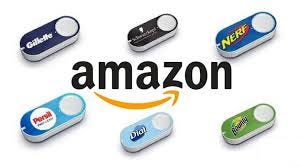
In its quest to ever improve the user experience of it’s products, AMAZON came up with the DASH buttons a few years back. These buttons are hardware devices specific to consumer goods products which are sent to a consumer on request and are specific to them.
These are one click buttons to order consumer products where clicking the button once would mean one quantity of the product would be ordered and would be on it’s way to your home.
15. Flip Switch buttons:
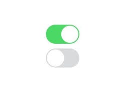
Flip Switch buttons are the e-version of the typical ON-OFF or toggle buttons. These have a limited use due to being able to cater to just 2 states or possibilities but deliver great user experience.
Apple iPhones use this in scenarios like when trying to switch off phone or in various settings options.
A ‘Flipswitch’ framework has also been developed for iOS to control or toggle various options, features by simply clicking on their icons in the phone screen. This improves the user experience by reducing user clicks and making feature and app usage more intuitive.
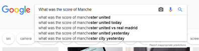
16. Type ahead:
This has 2 variations.
i. One (the more popular one) in which as we start typing in a field, it gives suggestions to complete what we are typing. Google search has this.
ii. The other variation is more specific to list of value fields where as we start typing out in a field, suggestions of all similar values in the list are given for selection. The list of suggestions keep reducing as a user types more letters into the field.
17. Placeholders:
This is also one my personal favorites as it makes optimal use of the available space and gets the message conveyed to the user.
This is a feature in which the instruction for a particular field is embedded within the field box and is made optimally visible using color contrast to the color of the field’s box. As a user types into the field or selects a value from the field’s list of values, the placeholder text disappears. This is mainly used in applications or websites to hand hold the user or places where the user may not be very tech savvy.
18. Fingerprint logins & incorrect pass-code screen behavior:
Fingerprint logins, although quite obvious is a wonderful feature immensely improving user experience and reducing the number of clicks needed. A natural extension of this would be facial recognition to unlock one’s phone without even touching the home button.
Additionally, I’ve personally loved the inspiration behind the behavior of Apple iPhone’s login passcode when entered incorrectly. The passcode moves sideways just like a person nodding one’s head to disagree with anything. This feature beautifully mimics human behavior thus removing the need to have an error text indicating incorrect passcode entered.
Category 4: Others
19. Auto grouping to form photo/video collections:
Automatic formation of collections of photos and videos based on time and location in mobile phones. This feature is extremely useful when looking for specific photos or videos in the phone gallery.

20. Auto validations:
This is a feature which gives the user a real time experience of knowing right away if a new password being set follows the minimum guidelines laid out or if a new username being set already exists or not.
Most of the websites and mobile applications use this auto validation feature in their onboarding process now.
Gone are the days when a user would need to type out the username and/or password and hit create to get back the validations results that the username entered already exists or if the password entered does not follow the password rules for the portal.
21. Auto activation of phone screen:
Auto activation of phone screen as we pick up our mobile phones to do something, even without pressing or clicking a button gives a good user experience saving the extra clicks for the user.
22. Rating user reviews:
I have often seen that in the product’s review section in many websites like AMAZON, FLIPKART etc, the best reviews show up at the top and then rest are displayed in the descending order of their helpfulness. This helps keep the readers get the needed information in the topmost reviews itself thus eliminating their need to scroll more.
The reason the reviews are stacked like this is that these companies have in house mechanisms to rate the reviews based on parameters like length of a review, frequent usage of quality words in the review and so on.
These companies actually quantify the helpfulness of reviews and then stack them in the descending order of the score, all for improving the experience of their users.
23. 1-Click Ordering:
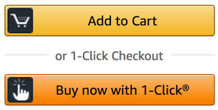
AMAZON came up with this feature of 1-click ordering on it’s portal where if a user has ever ordered a product through AMAZON then the user’s shipping address and payment option details will be saved. Next time whenever a user comes back to the AMAZON portal, the user will see this 1-click ordering option using which the user can go ahead and order the product skipping the cart options/screens.
This has helped AMAZON reduce it’s shopping cart abandonment over the years and helped the UX by drastically reducing the number of clicks for users.
24. Auto screen rotation:
Auto-rotation of mobile phone apps like YouTube when the phone is tilted is a great feature allowing the user to not expand applications like YouTube every time the user tilts the phone and wishes to see a video in a bigger screen.
25. Read Receipts:
This was a pioneering feature launched by Whatsapp in 2014, later adopted by many other messaging platforms.
The core idea of this feature is to let the sender know if the message was delivered to or read by the recipient. It had it’s fair share of controversies amongst the user community with privacy and security concerns voiced out.
WhatsApp did add the option for a user to now allow the sender to see if the message was read or not.
As a reward for staying with us till the end, here are 2 bonus interactive design examples for you -
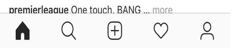
26. Feed pull refresh feature:
Feature Credit: Suhas Motwani (https://www.linkedin.com/in/suhasmotwani/)
Perhaps one of the most innovative design features developed in the last few years where all that a user needs to do to refresh the app feed is pull the feed downwards.
This is extremely intuitive and leads to a great user experience with minimal clicks.
27. Page progress circle or bar:
Feature Credit: Utkarsh Singh (https://www.linkedin.com/in/utkarshsb/)
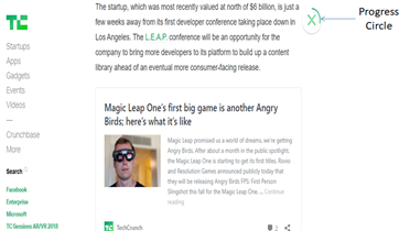
This is added mainly in news websites or blogging websites where often while scrolling through long reads a user wants to know how much more. To show this real time, a feature of a progress bar or circle is added in many websites to show how much of the article has already been read by the user and how much more to go.
If you know of other such examples of clever interactive designs then feel free to mention them in the comments section here and help us all get clever’er :)

